We all need a website. It is the extension of our business self. Sometimes it is really just an extension of yourself, but I am always hesitant to use that example because then people make em look like a reskinned myspace with top 8’s and favorites songs and it is all my fault. So, business self will do for now.
Make It Boring
A website should be boring. Seriously try less, it will be better. The work itself should be the best part and the focus. That is why whoever is looking at it, is there. This isn’t 2007, we all know how to internet now. Well, unless you are someone like my dad – then you just think you know how to internet. Which is arguably worse, but that is another story for another time. Most people know how to internet well, and it is a fast process. There is a lot of content to intake and people want to spend their time efficiently. That means you’re website just has one job and it should do it very very very well.
Get people the information they want, quickly. In order to do this, your website needs to load quickly, be well laid out and cut all the unnecessary features.
The three things you need in a portfolio website
- Portfolio
- Contact
- About
That is really it. Sometimes contact and about can even be combined into one.
Portfolio
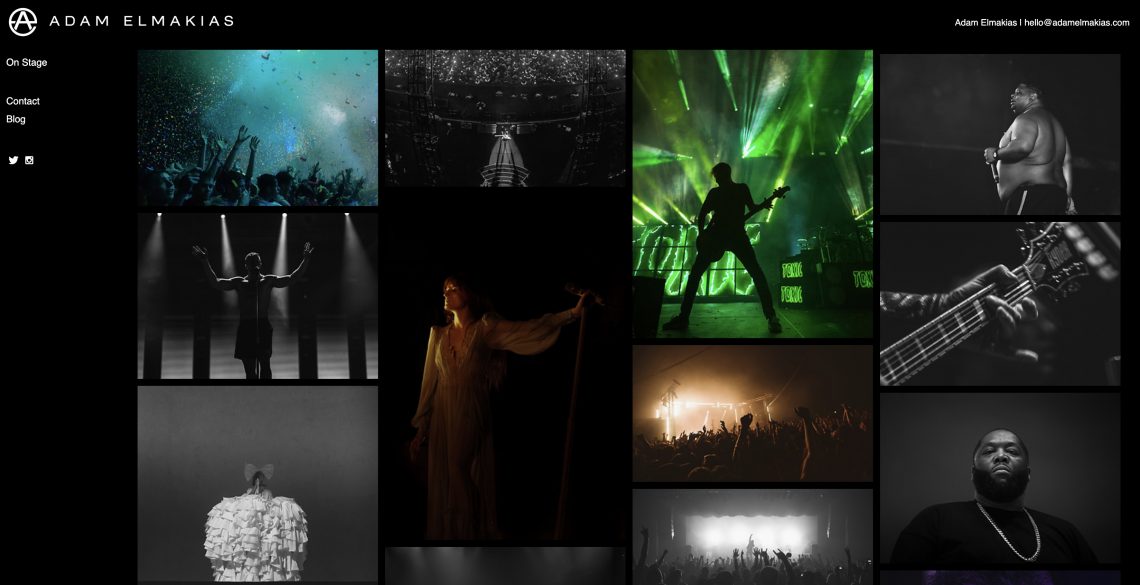
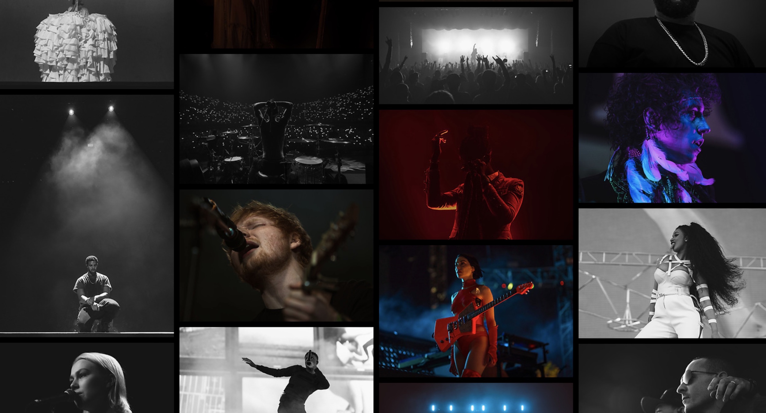
The portfolio is a collection of images that shows what you want to be hired for.
Share What You Want To Get Hired For
If it’s not the best of your best work, then why the hell are we here? Do not waste your viewer’s time. Also if you want to be a wedding photographer, show them wedding photos. Don’t show the dog photos, keep those in your hard drive or send them to me. I love dog photos.
Update Often
This is very important when you are starting out. It becomes less important the busier you get. As you shoot, update people. Show them where you are at, how good you are – and what you’ve been shooting. You work hard, and people deserve to see it.
No Repeat Images From The Same Shoot
Do not share repeat images from the same shoot. I get it, you are just starting out, you haven’t shot much – but don’t show people that. If it means only having ten images total on your website, so be it. But the last thing you want to show is five photos from the same shoot. There are some exceptions to this like maybe the images are very different and both amazing. But aside from that, just don’t do it.
Don’t Be An Idiot – Be Considerate
There are a lot of things that fall under this category. But to sum it up – if you have to warn someone about what they are about to see, maybe do not put it in your portfolio. Unless you are exclusively a War photographer, or nude art photographer and people should expect to see shocking images, I would avoid them altogether. For example, I do not have any images of people with bloody noses from just getting rocked in a mosh pit in my portfolio.
Contact
Contact is a collection of all the information your potential clients need to know before they consider reaching out to you to hire you for a job. They need to make sure you are based in the right location and that they can get a hold of you in a timely manner. This means you should include your name, location, e-mail, and phone number.
Name
Just put your first and last name down. If you have a cool nickname you go by, then, by all means, do that instead. But it better be really flippin’ cool. Hint: 99.9% of nicknames aren’t really flippin’ cool.
Location
Based out of means you travel a lot but maintain a headquarters or home office at the given location. Based in suggests that you work in a given location most of the time and do not travel as much. Figure out where you live and write it down. This shouldn’t be too hard assuming you know where you are at. So for me, I say based out of Los Angeles, CA.
Ideally, one that you check daily. You want to get back to people within 24 hours of receiving an e-mail. If they want to get ahold of you and have a quicker response time, they will usually call you. If you can get a custom domain name e-mail, I really suggest using that. Mine is hello@adamelamkias.com.
Number
This is so a potential client can get a hold of you quickly if they need to. If you do not want to be called, do not include your phone number. I suggest getting a google voice number for this. This way you can kind of separate the two, and if you ever have to change numbers – it keeps this one consistent. For example, my main number is still a Wisconsin 608 area code number, but my google voice is an LA area code. I do not have one on my website because I was simply getting way too many calls that were just people wanting to see if it was my phone number.
About
The goal of your about section is to communicate a bit of character about yourself. Where did you grow up? What do you like to do in life outside of photography? Keep it to a few paragraphs tops, and one can/ will be enough for some.
Photo Of You
Professionally unprofessional is the best way to describe this. I think my current one is too professional-looking, but then again my old one was probably too far in the other direction, so I am just evening it out. We don’t want you to look like a CEO of a banking company, but you also shouldn’t use your go-to default dating website image – Somewhere in the middle. It doesn’t need to be that big, about this size of the image below is ideal.
Socials
You can put your socials in either the about or contact section. Whatever works best for you. My rules are that they need to be professional and active. Don’t link a dead account, you are wasting their time.
Common Mistakes
These are the common mistakes, there are many more mistakes you could make. I probably have a few on my website my now I just haven’t learned about yet. So I invite you to teach me. If you see something you hate or it doesn’t make sense – tell me. I want to get better!
Music
If someone wants to listen to music, they will be. Chances are they don’t want to listen to your music.
Prices
Don’t post your prices. At the very least make someone contact you for them, and then send them to ’em. This forces people to connect with you.
Bizzare Color Schemes
Make the photos be the most eye-catching thing on your site. The last thing you want your viewer to go through is struggling to see your images because you decided on neon green for your background color. Black, white, gray and a few accent colors. That is all you need.
Weird-Ass Fonts
Keep it simple. A few fonts. Nothing cursive or wingdings like. You want your viewer to be able to read it well.
Photography Portfolio Websites
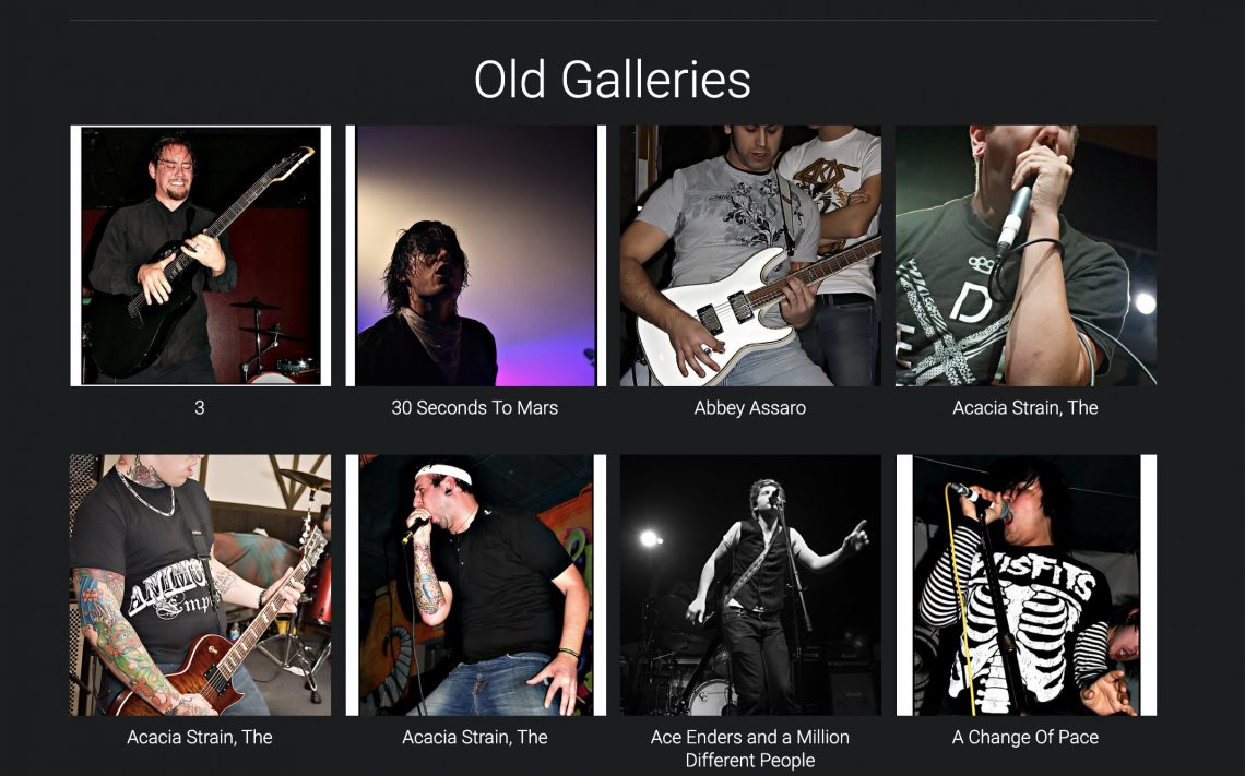
Smugmug
Smugmug is very customizable and easy to understand. I am proud to say I have been using it for over 13 years. I mostly use it for client galleries and making prints, but the possibilities are endless. The company is backed by wonderful people and it makes me happy to support them.

Photoshelter
Photoshelter is great for portfolios, that is exactly what I use it for. They have a bunch of other perks as well that allow photographers to basically create a one-stop-shop for everything they might need – client galleries, prints, storage etc. Also my favorite are the following two, which allow them to also serve as a cloud service for your images.
- Upload any size photo (no limit)
- Upload any image file type (including RAW)
view my Photoshelter portfolio

Other Website Options
Squarespace
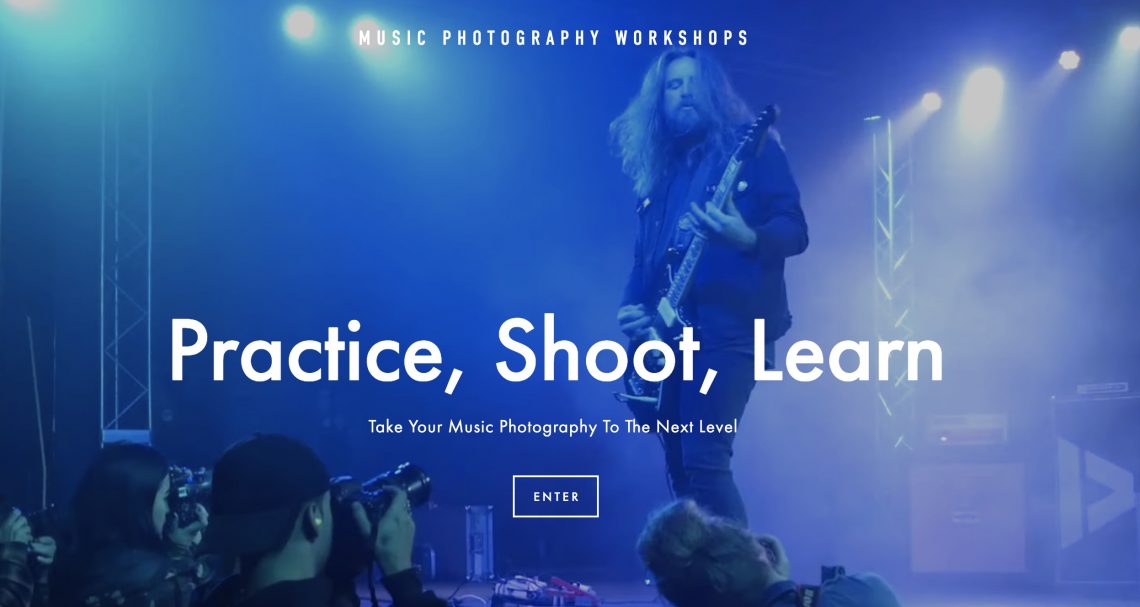
So easy to fully customize, with a great amount of variety to their templates. I currently use them for my Music Photography Workshop website.
view Music Photography Workshops website

WordPress
This is great if you want to have a blog as one of your main focal points. There are an infinite amount of template options for WordPress. It can be quite overwhelming at first, but once you get the hang of it – you have no limits! The site you are on currently is WordPress.
Level Up Your Website
Improve Your Portfolio
You can be doing this always. But sometimes you will have to self assign shoots to help your growth go in the direction you want. The best way to improve your site will always be to make better images.
Custom Domain Name
This is an easy one that makes a huge difference. They cost about $20 a year. Nothing too crazy. Most websites will assist in helping you set one up/ have a built-in way to do it.
Hire A Designer
I prefer to keep the layout and content of my website under my own control – but an easy way to make it look a little nicer is to hire a designer. Have them make your fonts cohesive, and your colors match. Something simple like that. I would advise against getting an entirely custom website. It is overkill for what we need these days.
Send Me Your Website
Do you think you have a pretty good portfolio website? Send me your URL. Twitter works best.
